The System
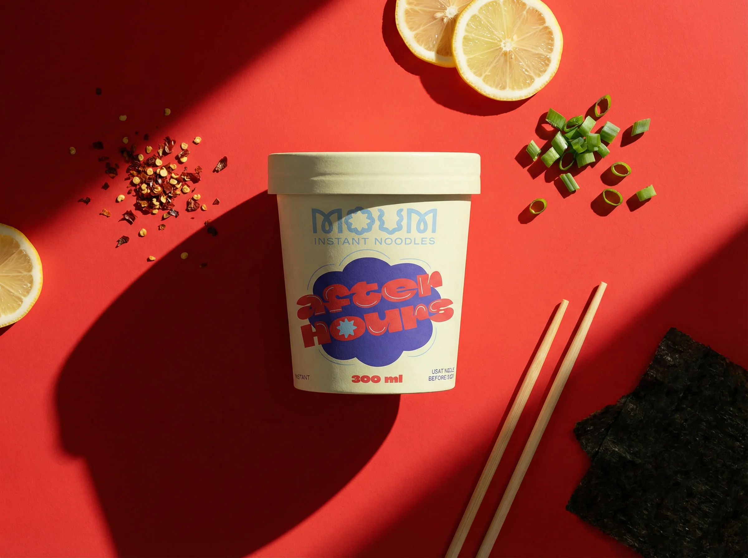
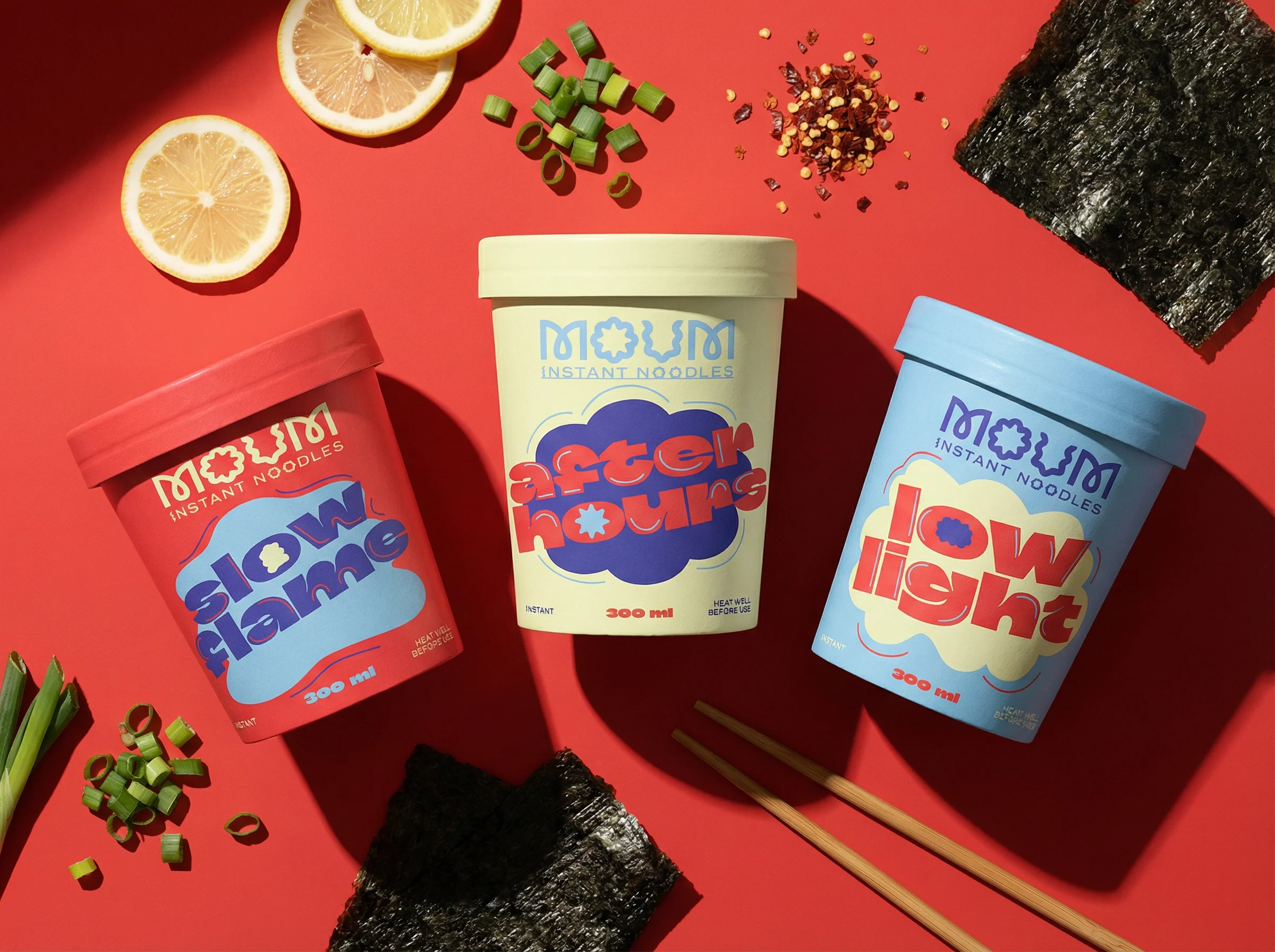
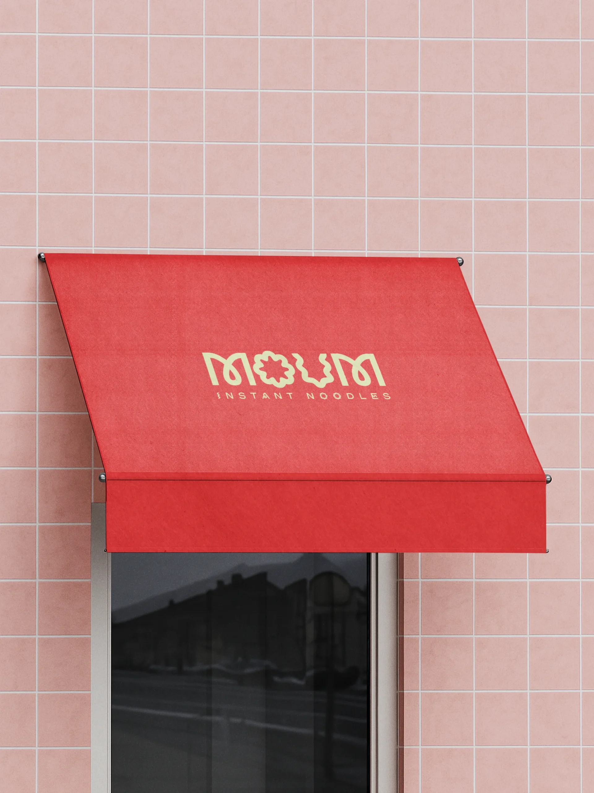
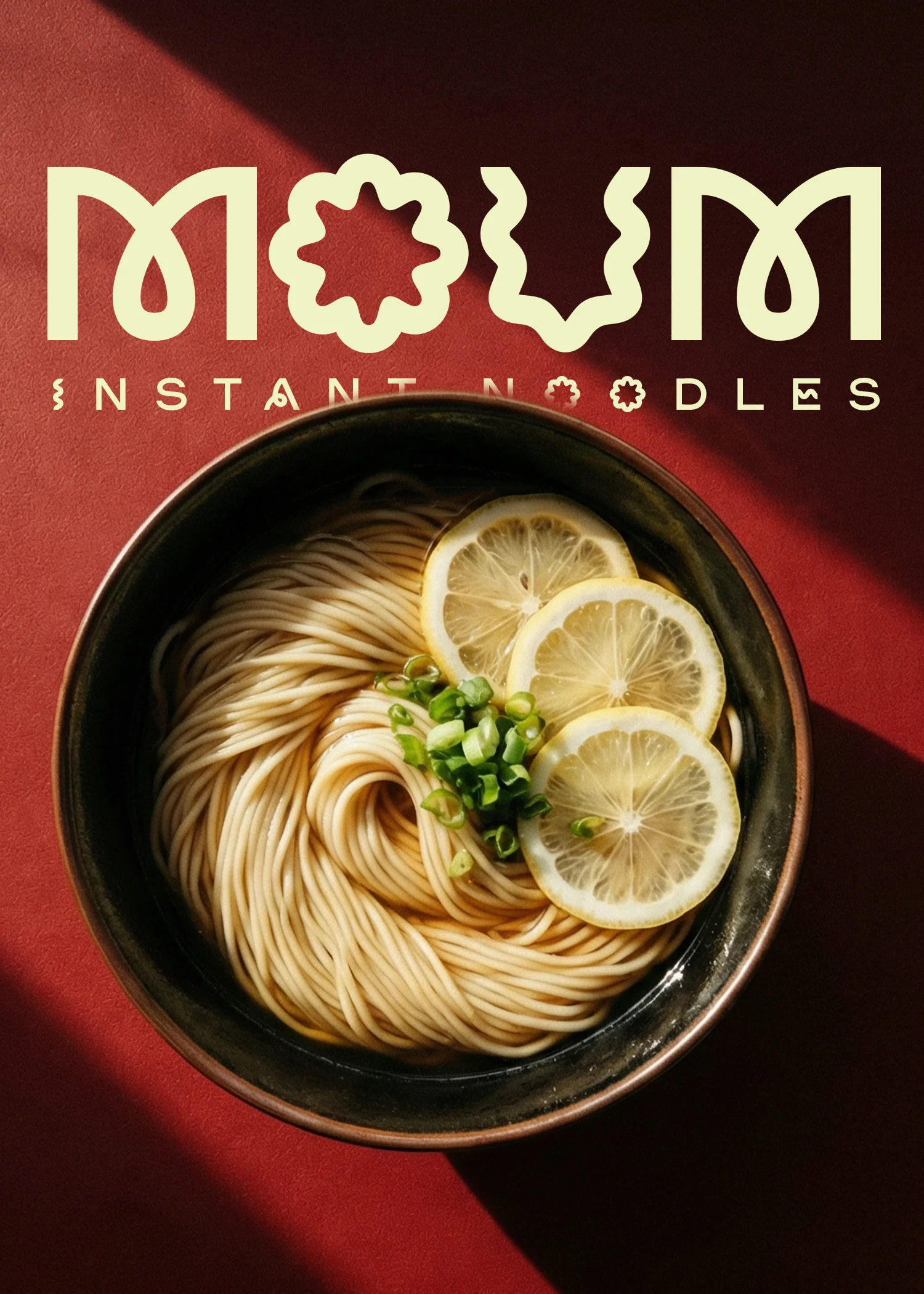
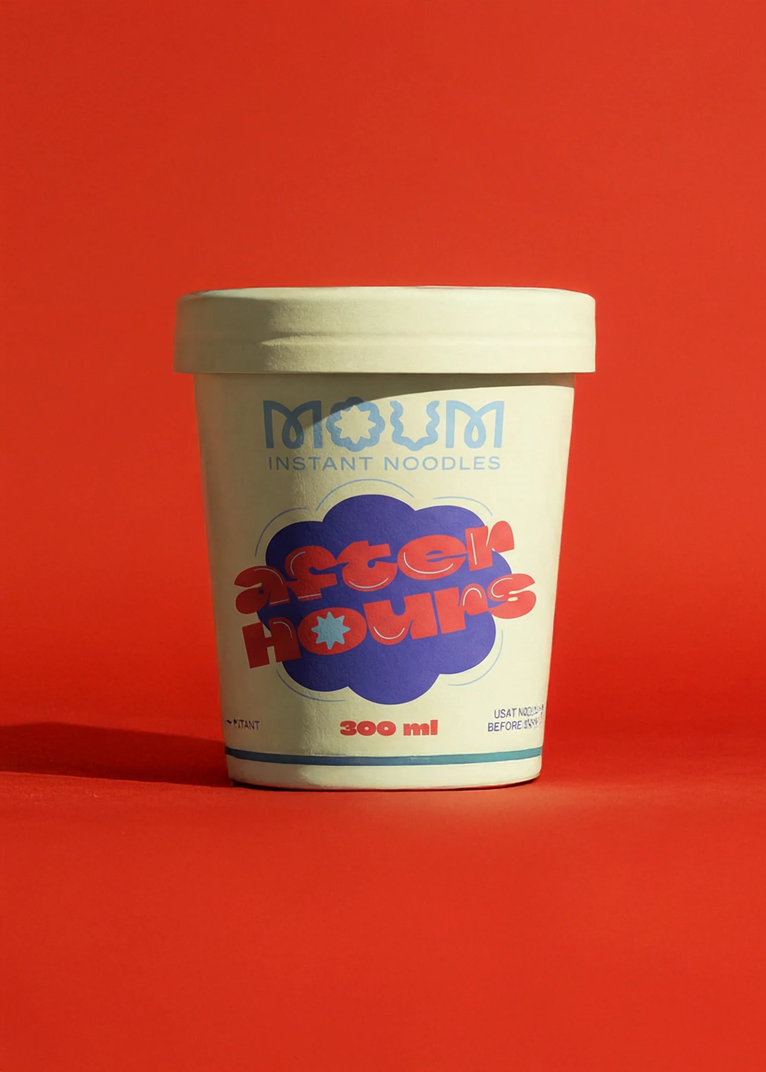
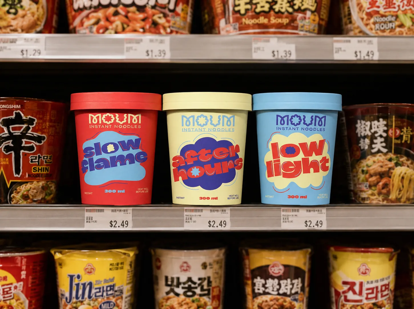
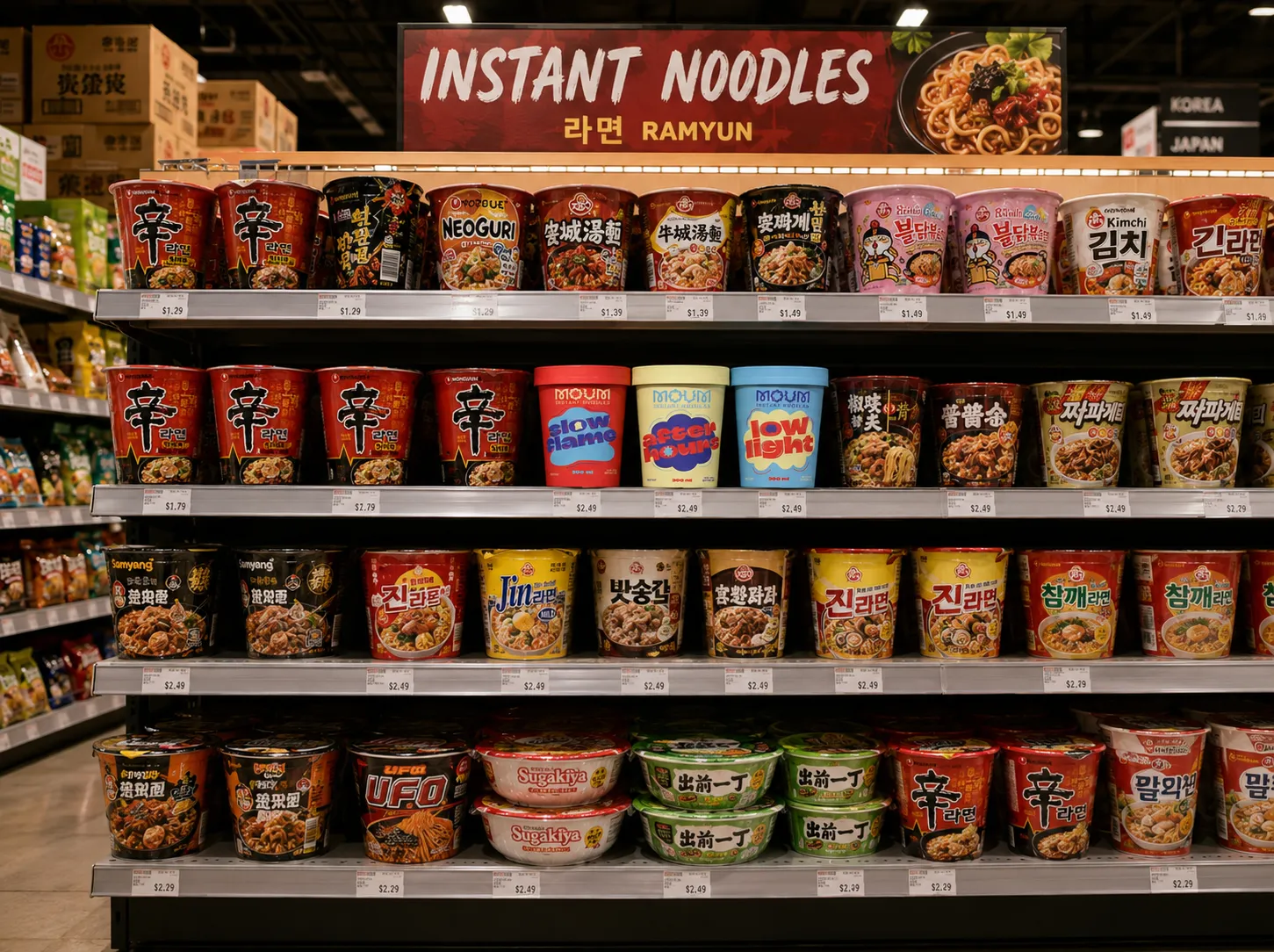
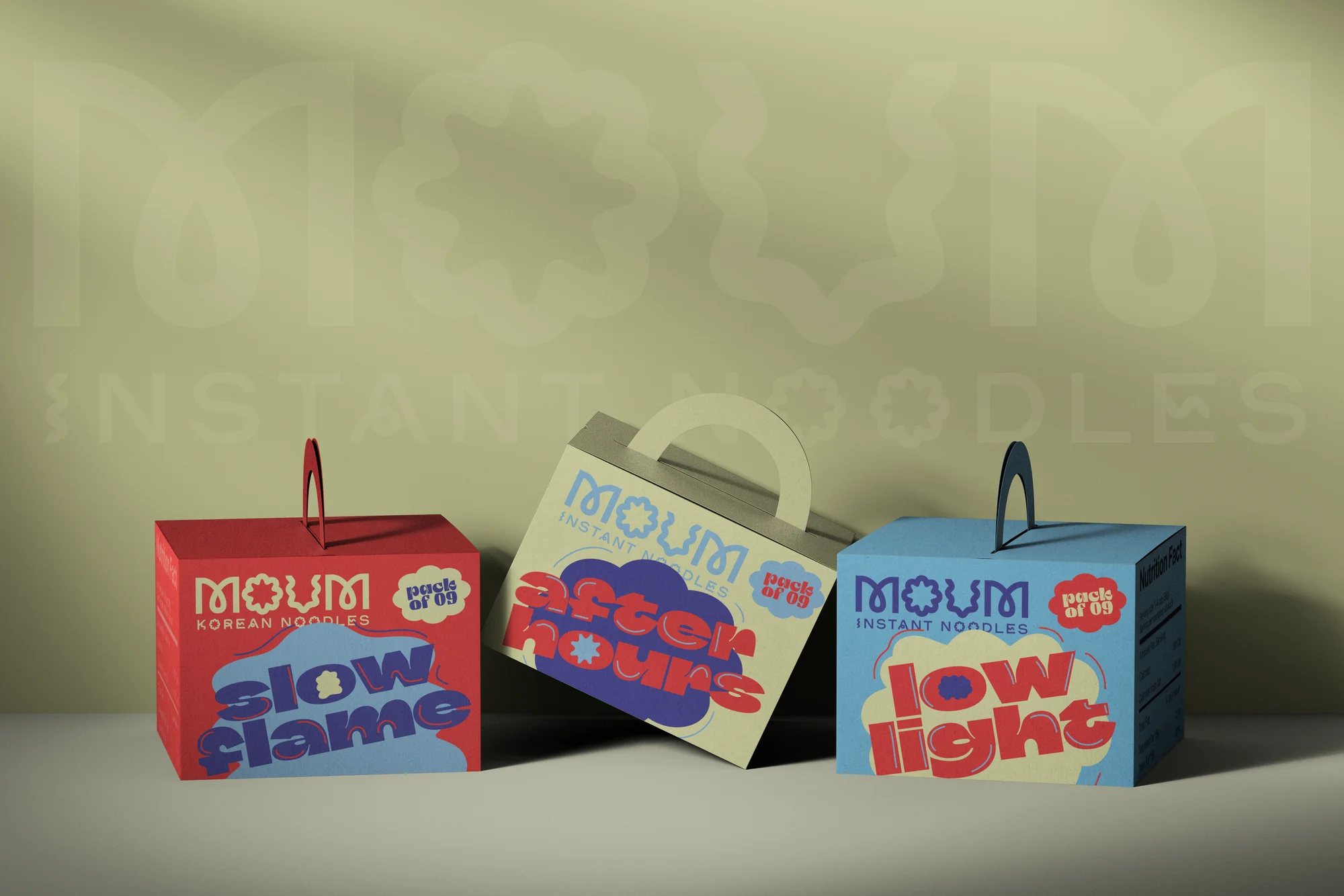
The flavour architecture replaces generic descriptors with atmospheric naming After Hour, Slow Flame, Low Light building cultural alignment into the product line itself. The visual identity balances bold typography, layered graphic composition, controlled colour systems, and structured hierarchy, drawing reference from poster culture, street graphics, and editorial layout systems. The logotype integrates abstract noodle forms while remaining scalable across packaging, retail, and digital applications. Every component was built to read as one coherent design language rather than a collection of pieces.