Imposing Doors
of Rome

Service
Brand and Strategy Direction, Art Direction
Client
Reddy Vatti
Year
2025
Category
Publication & Editorial

Build streamline and evolve together with solution

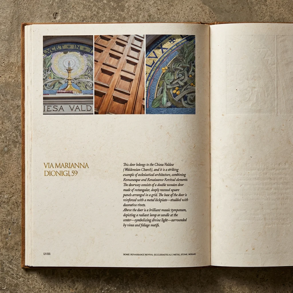
Afirm Global designed Imposing Doors of Rome, a 400-page editorial publication documenting architecturally significant doorways across Rome and Vatican City. The book was conceived as a collectible architectural object rather than a conventional photography publication — a printed work built to honour the craftsmanship, symbolism, and historical weight of the entrances it captures. Drawing on classical Roman proportion, vintage European architectural monographs, and the visual restraint of museum-quality publications, the book reads with the calm authority of a scholarly catalogue. Across nearly 400 pages, it presents Rome’s doorways not as photographic subjects, but as architectural identities objects carrying centuries of religion, politics, and urban memory.

The Concept & Design

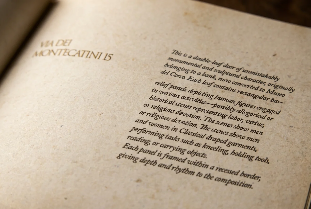
Working from extensive research into Roman architectural tradition, Renaissance proportion, and the typography of classical Italian monographs, the book was designed to disappear behind its subject. The grid, the metadata system, the pacing of the spreads, every element was developed with the same logic the doors themselves were built with. Symmetry. Restraint. Quiet authority. The 400-page publication contains hundreds of architectural photographs sequenced into a continuous visual narrative. Image editing and full colour grading were handled across the entire library, preserving the natural patina of Roman stone, wood, and metalwork without commercial polish. The typography system draws from classical Roman inscription refined serif faces, Roman numeral pagination, and metadata lines that read as scholarly annotation rather than caption.

The Outcome

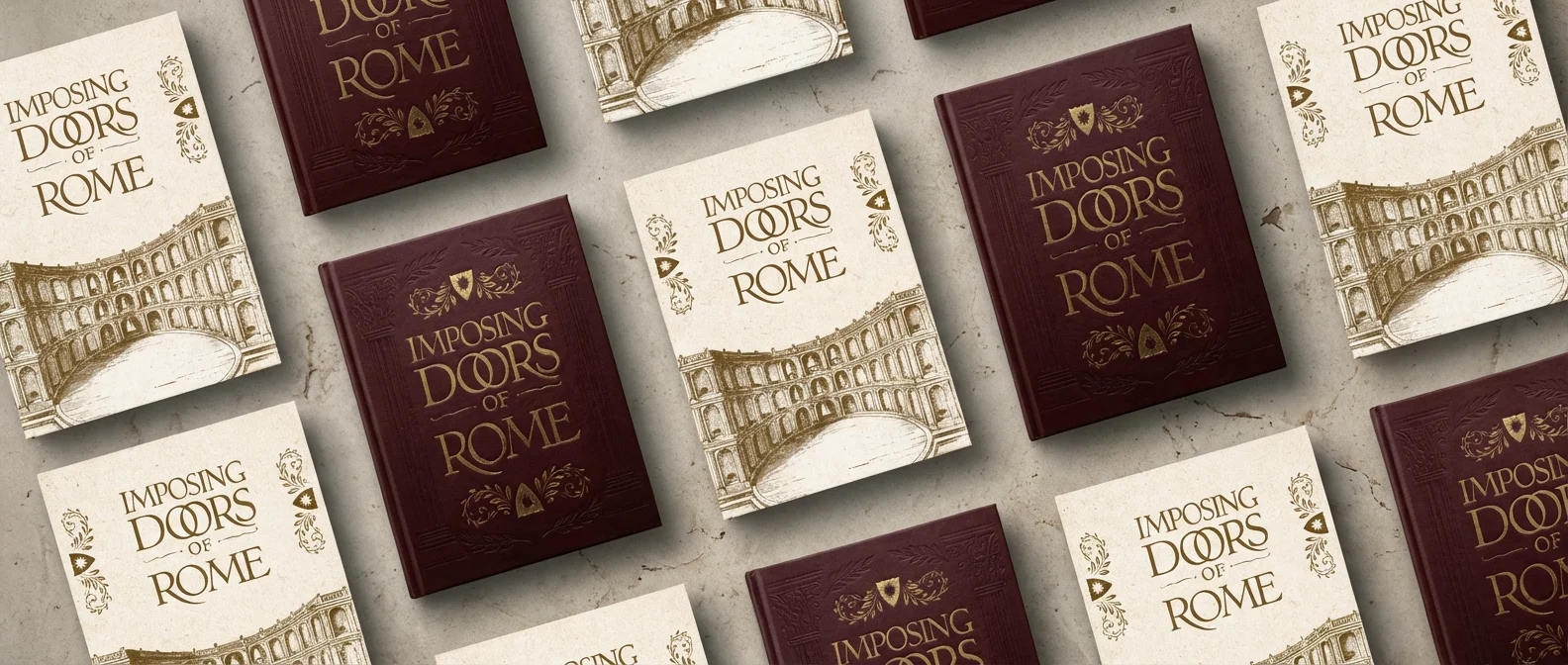
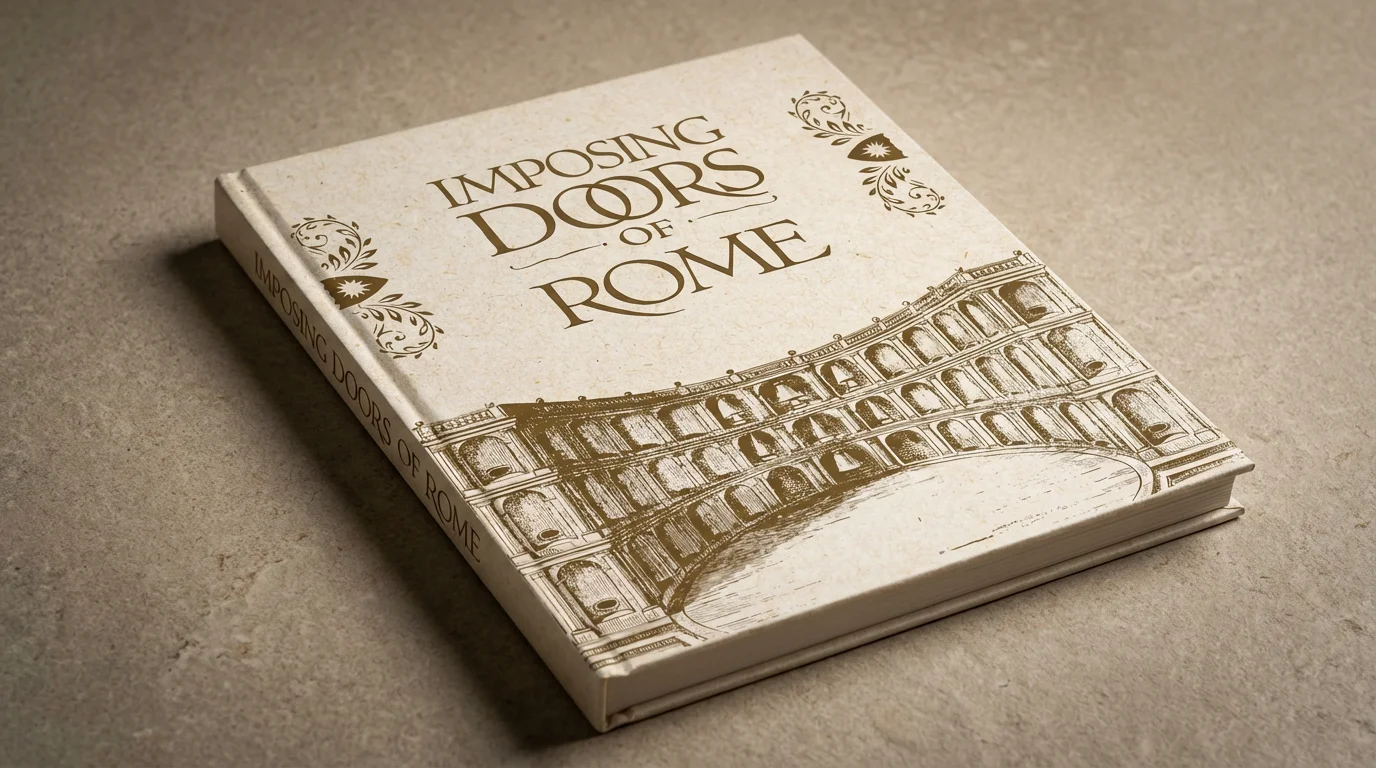
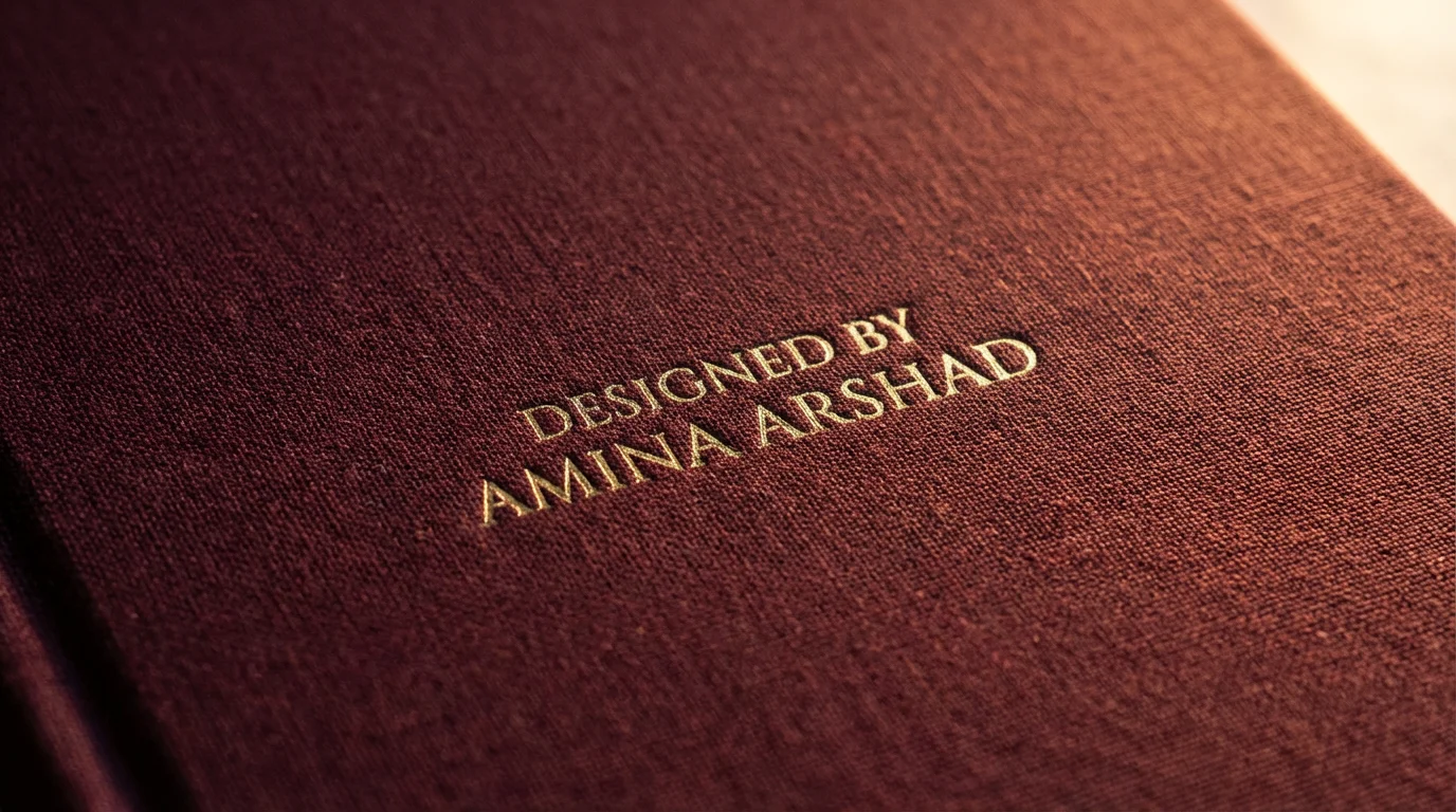
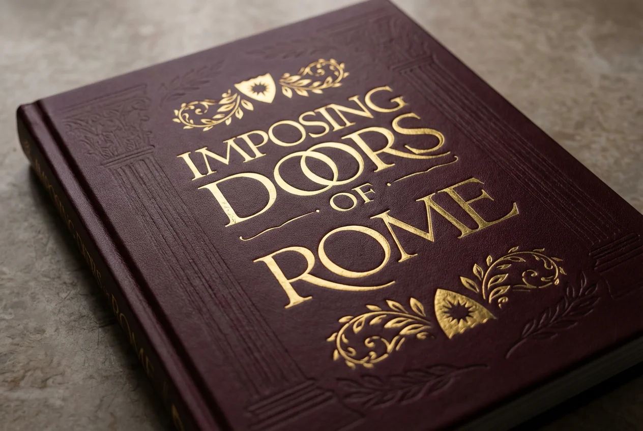
A 400-page publication that reads as a museum-grade architectural artifact calm, sophisticated, and quietly authoritative. Two cover directions were developed for print: a deep burgundy textile with debossed detailing and gold foil typography, and a heritage parchment edition referencing classical Roman engraving. Both built for the format the book actually lives on the shelf.