Nebula Brew

Service
Brand and Strategy Direction, Digital Experience
Client
CCTC
Year
2021
Category
Food & Beverage

Brewed from Another Dimension

Nebula Brews began with a challenge that most independent coffee brands overlook: specialty coffee packaging has become visually predictable. Matte earth tones, handwritten scripts, minimalist beige labels and “craft coffee” aesthetics dominate the market to the point where brands often blur together on shelves and social feeds. The goal for Nebula Brews was to create a coffee identity system that immediately disrupted those expectations while still feeling premium, intentional, and rooted in quality rather than novelty.


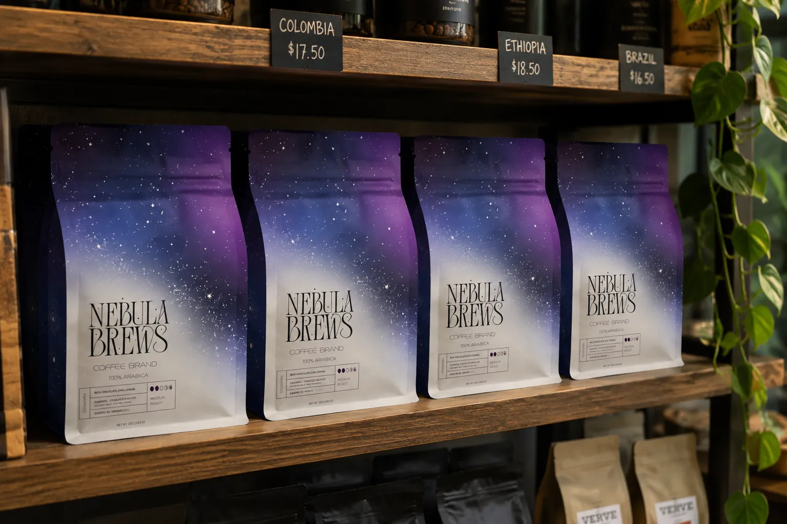
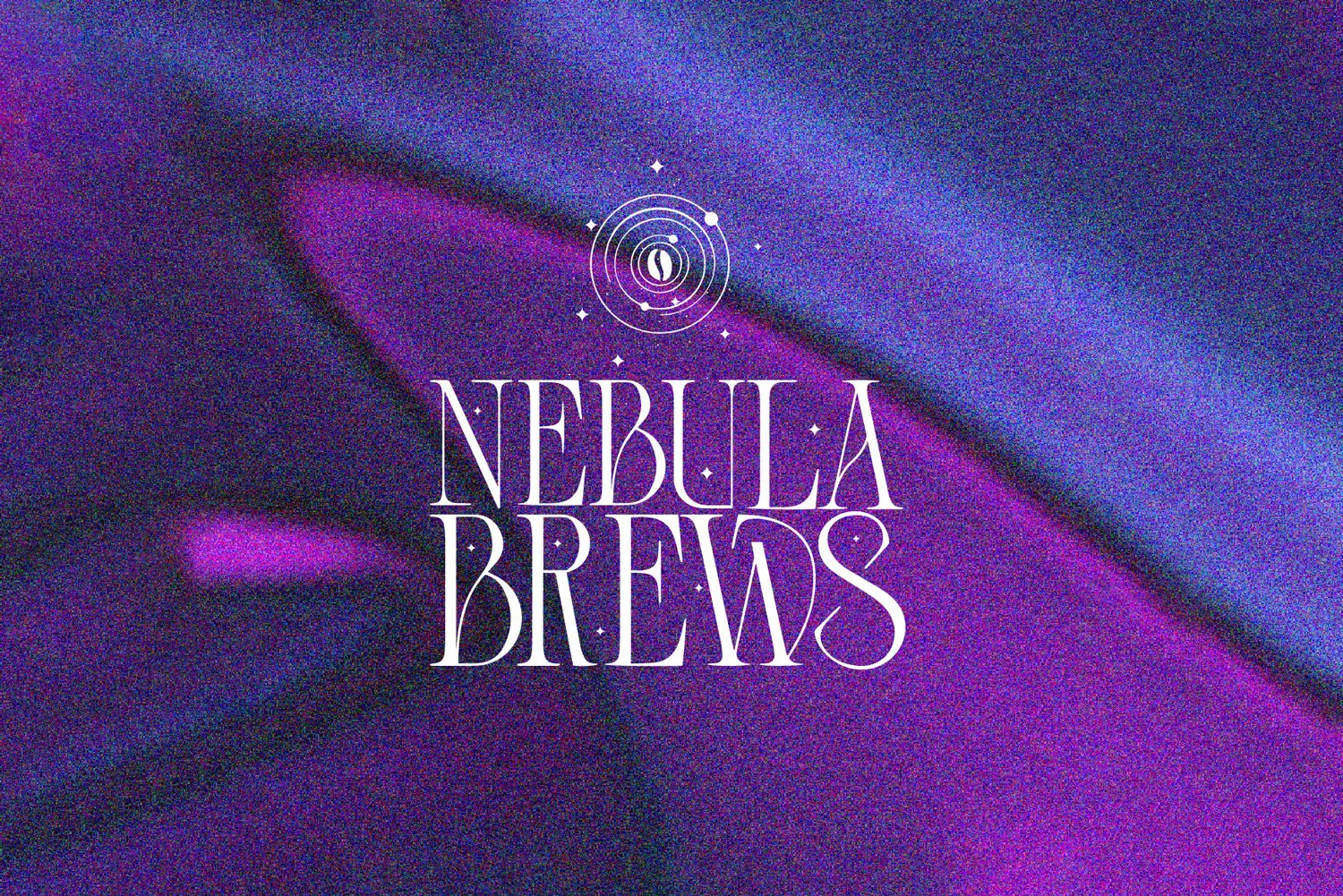
One of the biggest design challenges was balancing maximal visual impact with clarity and sophistication. Galaxy-inspired branding can quickly become gimmicky or overly “sci-fi,” so the system was carefully restrained through typography and composition. The custom wordmark uses an elegant high-contrast serif that feels editorial and luxurious rather than futuristic, allowing the identity to retain credibility within the specialty coffee market. White typography was intentionally used across the packaging to create sharp contrast against the dark cosmic gradients while preserving readability both in print and in real-world retail environments.

The Packaging Concept

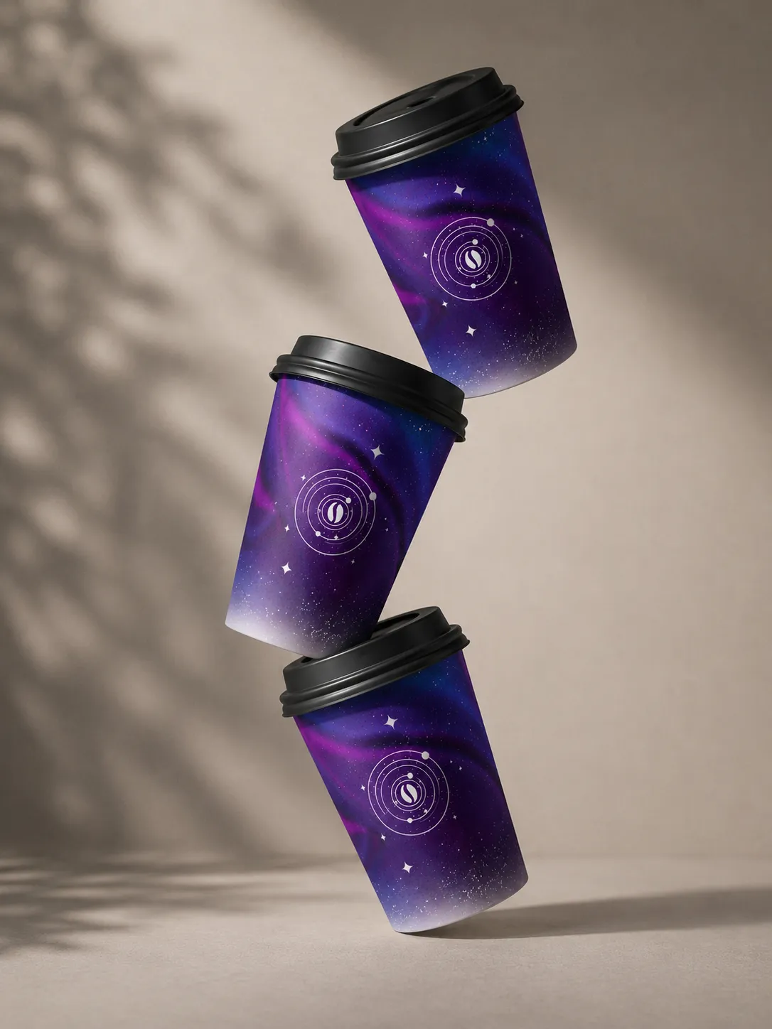
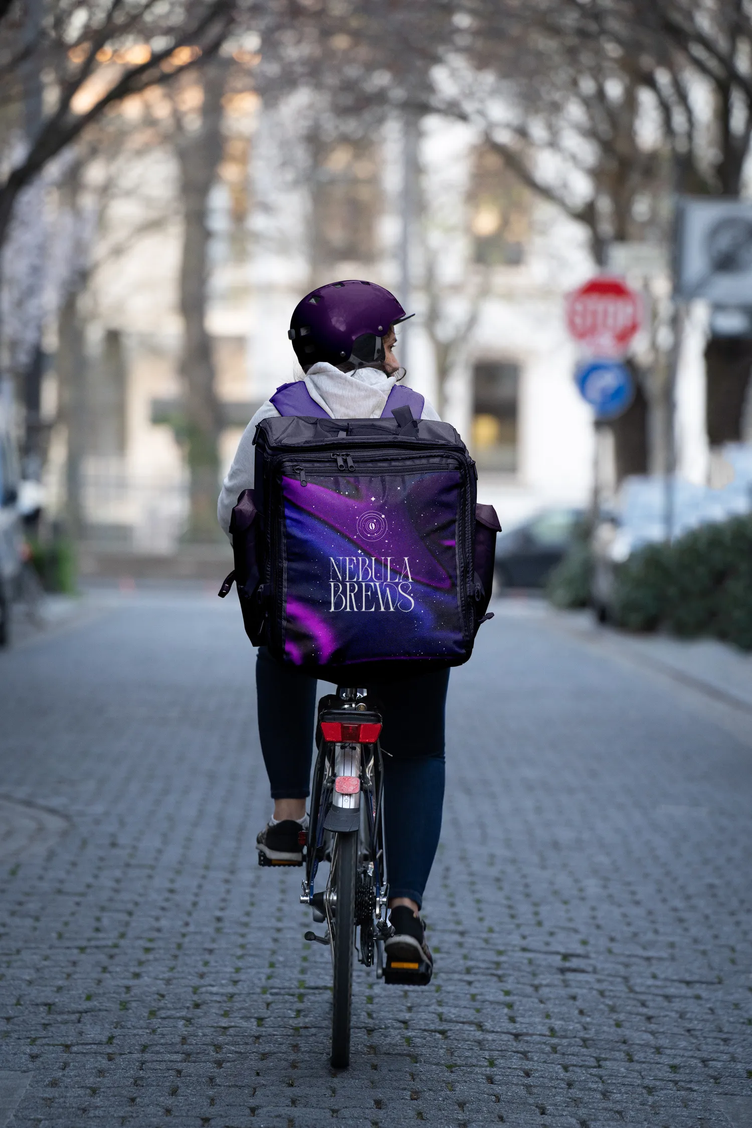
The packaging system was designed to work dynamically across multiple touch-points including retail coffee bags, takeaway cups, café signage, and social media mockups. Rather than relying on static label blocks, the nebula textures wrap organically around the forms of the cups and bags, creating movement and depth that make the products feel immersive and tactile in photography. This approach helps the brand stand out dramatically in cafés and grocery environments where most coffee packaging competes through muted minimalism.


Another challenge was ensuring the identity felt premium in realistic production scenarios. Disposable coffee cups and coffee bags often lose visual richness when translated from flat graphics into physical materials, so the branding was tested through highly realistic mockups with textured paper surfaces, natural shadows, matte finishes, and cinematic lighting setups. This helped establish how the gradients, grain, and typography would behave in real-world environments rather than only on a clean digital canvas.

The Result

The orbital symbol system introduced throughout the identity acts as a secondary branding device that can function independently from the wordmark. Inspired by planetary paths and celestial diagrams, the icons reinforce the “cosmic ritual” narrative while also creating recognizable shorthand branding for cups, stickers, signage, and merchandise.
Ultimately, Nebula Brews was designed to challenge the visual conventions of specialty coffee branding. Instead of romanticizing coffee through nostalgia or rustic craftsmanship alone, the identity reframes the experience as something atmospheric, modern, and emotionally transportive, turning an everyday cup of coffee into something that feels cinematic.